
by Guru IS | Jan 4, 2026 | Tutorials
Understanding the Importance of Local SEO in 2025
In the rapidly evolving digital landscape of 2025, mastering Local SEO is more crucial than ever for businesses seeking to enhance their online presence. With consumer behaviors shifting towards hyper-local searches, the ability to optimize your business for local SEO can be the differentiator between thriving and merely surviving. Local SEO focuses on optimizing a website to be found in local search results. This means that when potential customers search for services or products you offer in your area, your business should appear prominently.
Local SEO has evolved significantly and now integrates more seamlessly with voice searches, mobile optimization, and location-based marketing. It’s not just about getting your business on the map; it’s about ensuring that when people are nearby, they find you first. Understanding the nuances of Local SEO will position your business to capture the local market effectively.
The Core Components of Local SEO
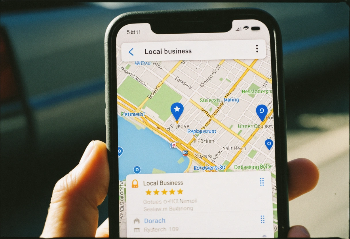
To master Local SEO, you must grasp the core components that influence search rankings. At the heart of Local SEO is the ability to optimize your Google My Business (GMB) listing. This invaluable tool allows businesses to manage their online presence across Google, including Search and Maps. Ensure that your GMB profile is complete, accurate, and regularly updated with current information about your business, such as operating hours, address, and contact details.
Another critical component is local citations. These are mentions of your business name, address, and phone number on other websites. Consistency in these citations is key, as discrepancies can confuse search engines and harm your rankings. Additionally, gathering and managing customer reviews on platforms like Yelp and TripAdvisor enhance your local SEO, as positive reviews signal trustworthiness to search engines.
Optimizing Your Google My Business Profile
Optimizing your Google My Business profile is foundational to any local SEO strategy. Start by claiming your GMB listing, if you haven’t already, and ensure all business information is up-to-date. Make sure your business name, address, and phone number are consistent with those listed on your website and other online directories.

Include high-quality images to make your profile more appealing. Regularly post updates about new products, services, or upcoming events to keep your audience engaged. Additionally, encourage satisfied customers to leave positive reviews and respond to these reviews promptly. Engaging with your customers online showcases your business’s commitment to customer service and can significantly boost your local search rankings.
The Role of Keywords in Local SEO
Keywords remain a cornerstone of SEO, and local SEO is no different. Conduct thorough keyword research to identify phrases that potential customers in your area are likely to use. Long-tail keywords, which are more specific and often longer phrases, can be particularly effective in targeting niche markets within a geographical area. Tools like Google’s Keyword Planner or SEMrush can help identify these valuable terms.
Once you’ve identified the right keywords, integrate them naturally throughout your website content, including titles, headings, and meta descriptions. Avoid keyword stuffing, as this can lead to penalties from search engines. Instead, focus on creating high-quality, relevant content that naturally incorporates these keywords.
Content Strategy and Local SEO
Developing a robust content strategy is integral to mastering local SEO. Create content that is not only relevant to your products or services but also resonates with your local audience. Consider writing blog posts about local events, news, or partnerships that relate to your industry. This not only positions your business as an active community participant but also increases your chances of appearing in local search results.
Additionally, consider creating location-specific landing pages if your business serves multiple areas. Each page should provide unique content tailored to that location, enhancing your relevance in local searches. Ensure each page is optimized with local keywords and includes information pertinent to that specific area.
Leveraging Social Media for Local SEO
Social media platforms are powerful tools for enhancing your local SEO efforts. They provide additional channels for promoting your content and engaging with your community. Facebook, Twitter, Instagram, and LinkedIn offer opportunities to create location-based content that can drive local traffic to your website.
Regularly update your social media profiles with fresh content, including promotions, events, and news about your business. Encourage your followers to share your posts to increase your reach within the local community. Social signals, such as likes, shares, and comments, may indirectly influence your search rankings by driving traffic and increasing your online visibility.
Building Local Links
Building quality local backlinks is a crucial aspect of enhancing your local SEO. Focus on acquiring links from reputable local businesses, community organizations, and industry-specific directories. These backlinks signal to search engines that your business is credible and relevant within your local area.
Consider collaborating with local influencers or bloggers to feature your business in their content. Sponsor local events or charities and request a link back to your site from their event pages. These strategies help build a network of local links that can enhance your search visibility.
Measuring the Success of Your Local SEO Efforts
Tracking and measuring your local SEO efforts is essential to understanding the effectiveness of your strategies. Utilize tools like Google Analytics and Google Search Console to monitor your website’s traffic and search performance. Pay attention to metrics such as organic search traffic, bounce rates, and conversion rates to assess how your local SEO efforts impact your business.
Regularly review your rankings for local keywords and adjust your strategies based on the data. By consistently monitoring and analyzing your performance, you can make informed decisions to optimize your local SEO strategy further.
Embrace Local SEO for Future Success
Mastering local SEO in 2025 involves a combination of optimizing your online presence, engaging with your local community, and continuously adapting to the latest trends and technologies. By understanding the importance of local SEO and implementing comprehensive strategies, businesses can effectively increase their visibility in local search results, attract more customers, and ultimately achieve long-term success.
As the digital landscape continues to evolve, staying updated with the latest developments in local SEO is crucial. By doing so, your business can remain competitive and continue to thrive in an ever-changing market. Embrace the power of local SEO to connect with your community and drive your business forward in 2025 and beyond.
Adapting to Emerging Trends in Local SEO
As we venture deeper into 2025, new trends are shaping the local SEO landscape. One significant trend is the increasing reliance on artificial intelligence (AI) and machine learning in search algorithms. These technologies have enhanced search engines’ ability to understand user intent, making it crucial for businesses to focus on delivering high-value, user-centric content.
Additionally, the integration of augmented reality (AR) into local search experiences is gaining traction. Businesses can leverage AR to provide users with immersive experiences that enhance their interaction with products or services. For instance, restaurants might use AR to allow customers to view dishes in 3D before ordering, creating a unique and engaging experience that can be shared on social media, further enhancing local visibility.
Voice Search Optimization
Voice search continues to grow in popularity, particularly for local queries. Users often employ voice assistants like Siri, Alexa, and Google Assistant to find nearby services or businesses. This trend requires businesses to adapt their SEO strategies to accommodate natural language queries, which tend to be longer and more conversational than traditional text-based searches.
To optimize for voice search, focus on creating content that answers common questions related to your business. Implementing an FAQ section on your website that addresses these queries can help capture voice search traffic. Additionally, ensure your website’s mobile experience is seamless, as voice searches are often conducted on mobile devices.
Mobile Optimization and Local SEO
With the majority of local searches conducted on mobile devices, ensuring your website is mobile-friendly is non-negotiable. A responsive design that adjusts to various screen sizes and fast loading times are critical factors in retaining mobile users. Google prioritizes mobile-friendly sites in its search results, making mobile optimization a key component of your local SEO strategy.
Beyond design, consider the user experience on mobile. Ensure that contact information, such as phone numbers and addresses, is clickable and accessible. Implement location-based services to provide personalized experiences for users who access your site from mobile devices in your vicinity.
Utilizing Data Analytics for Insightful Decisions
Data analytics plays a pivotal role in refining and improving your local SEO strategy. By analyzing data from tools like Google Analytics, you can gain insights into customer behavior, preferences, and engagement patterns. This information is invaluable in tailoring your content and services to better meet the needs of your target audience.
Look beyond basic metrics and delve into behavioral data, such as time spent on pages, conversion paths, and user flow. Understanding these patterns helps identify areas of improvement and opportunities for optimization. By making data-driven decisions, businesses can enhance their local SEO efforts and achieve better results.
Building a Community-Centric Brand
Fostering a strong community presence is an effective way to boost your local SEO. Engage with your local audience by participating in community events, supporting local causes, and collaborating with other businesses. These activities not only enhance your brand’s reputation but also generate local buzz and online mentions, which positively impact your local SEO.
Encourage user-generated content by creating campaigns that invite customers to share their experiences with your products or services. Highlight these stories on your website and social media platforms to showcase real-life interactions with your brand. This strategy not only builds trust but also provides fresh content that can improve your local search rankings.
Preparing for the Future of Local SEO
As we look towards the future, it’s evident that local SEO will continue to evolve in response to technological advancements and changing consumer behaviors. Staying ahead of these changes requires a proactive approach to learning and adapting. Regularly update your knowledge of SEO best practices, attend industry conferences, and participate in webinars to stay informed.
Additionally, keep an eye on emerging technologies that could impact local search, such as blockchain and the Internet of Things (IoT). By remaining agile and open to innovation, businesses can maintain a competitive edge and continue to capture local market share effectively.
Final Thoughts
In conclusion, mastering Local SEO in 2025 involves a multifaceted approach that combines traditional optimization techniques with innovative strategies to meet the demands of a dynamic digital environment. By focusing on user experience, leveraging data analytics, and engaging with the local community, businesses can significantly enhance their local search visibility.
As the digital landscape continues to shift, embracing these strategies will ensure your business remains competitive and positioned for success. With a commitment to continuous learning and adaptation, you can confidently navigate the future of local SEO and achieve sustained growth.
by Guru IS | Dec 31, 2025 | SEO
Understanding the Power of Local SEO: How Guru Can Help You Dominate Your Niche
In the ever-evolving digital landscape, businesses of all sizes are striving to gain a competitive edge. While global reach is often the ultimate goal, many companies find unprecedented success by focusing on local markets. This is where local SEO comes into play. Understanding the nuances of local SEO and leveraging its power can propel your business to new heights. With the right strategies and tools, such as those offered by Guru, you can dominate your niche and ensure your business stands out in your local community.
What is Local SEO?
Local SEO (Search Engine Optimization) is the practice of optimizing your online presence to attract more business from relevant local searches. These searches take place on Google and other search engines. They often include a location or the term “near me,” and they have a specific intent of finding businesses or services in a particular geographic area.
For example, if you own a bakery in San Francisco, you want your business to appear prominently in search results when someone in the area searches for “best bakery in San Francisco” or “bakery near me.” Effective local SEO strategies ensure that your business is visible to potential customers who are likely to convert because they are searching for services you offer in your area.
The Core Components of Local SEO
To fully harness the power of local SEO, it’s crucial to understand its core components. These include Google My Business (GMB), local citations, online reviews, localized content, and on-page SEO.
- Google My Business: Setting up and optimizing your Google My Business profile is the cornerstone of local SEO. It allows you to manage how your business appears on Google Search and Maps, providing essential information to potential customers.
- Local Citations: These are online mentions of your business name, address, and phone number (NAP). Consistent and accurate citations across various platforms enhance your local SEO performance.
- Online Reviews: Encouraging positive reviews on platforms like Google and Yelp can significantly impact your local search rankings and build trust with potential customers.
- Localized Content: Creating content that resonates with your local audience can improve engagement and increase your visibility in local searches.
- On-Page SEO: Optimizing your website’s meta tags, headers, and content for local keywords can enhance your site’s relevance to local searches.
The Role of Guru in Local SEO Success
As you delve into local SEO, you’ll find that it requires meticulous attention to detail and a well-rounded approach. This is where Guru’s expertise becomes invaluable. Guru offers a comprehensive suite of SEO tools and resources designed to help you implement effective local SEO strategies and monitor your progress.
One of Guru’s standout features is its ability to provide detailed insights into your local SEO performance. With Guru, you can track your search rankings, analyze your website’s traffic, and identify areas for improvement. This data-driven approach allows you to refine your strategies and make informed decisions that align with your business goals.
Local SEO Strategies to Dominate Your Niche
Now that we understand the basics of local SEO and the tools available, let’s explore some strategies to help you dominate your niche.
Optimize Your Google My Business Profile
Your Google My Business profile is a vital asset for local SEO. To optimize it effectively, ensure that all information, including your business name, address, phone number, and category, is accurate and up to date. Regularly update your business hours and respond to customer inquiries promptly. Additionally, use high-quality images and videos to showcase your products or services.
Build and Manage Local Citations
Consistency is key when it comes to local citations. Ensure that your NAP information is uniform across all online platforms, including directories, social media, and your website. Tools like Moz Local can help you identify citation opportunities and manage your listings efficiently.
Encourage and Respond to Online Reviews
Online reviews play a pivotal role in shaping your business’s reputation. Encourage satisfied customers to leave positive reviews on platforms like Google and Yelp. Respond to reviews—both positive and negative—in a professional and timely manner. This engagement demonstrates your commitment to customer satisfaction and can enhance your local SEO efforts.
Create Localized Content
Creating content that resonates with your local audience can boost your local search rankings and foster a sense of community. Consider writing blog posts about local events, collaborating with local influencers, and sharing customer success stories. Additionally, incorporate local keywords naturally into your content to improve its relevance.
Leverage Social Media for Local Engagement
Social media is a powerful tool for engaging with your local audience. Share updates, promotions, and events related to your business. Engage with your followers by responding to comments and messages promptly. Additionally, consider using location-based hashtags to increase your visibility among local users.
Measuring the Success of Your Local SEO Efforts
Measuring the success of your local SEO efforts is essential to refining your strategies and ensuring continued growth. Here are some key metrics to track:
- Local Search Rankings: Monitor your rankings for local keywords relevant to your business. Tools like Ahrefs can provide valuable insights into your search performance.
- Website Traffic: Analyze your website’s traffic to identify trends and patterns. Google Analytics is a powerful tool for tracking user behavior and identifying opportunities for improvement.
- Conversion Rates: Track the percentage of visitors who take desired actions, such as making a purchase or filling out a contact form. This metric is crucial for evaluating the effectiveness of your local SEO strategies.
- Customer Reviews: Monitor the number and quality of online reviews your business receives. Positive reviews can enhance your reputation and boost your local search rankings.
Taking Action with Guru
Local SEO is a powerful tool that can transform your business by increasing visibility, attracting more customers, and ultimately dominating your niche. By understanding the core components of local SEO, leveraging the right strategies, and utilizing tools like Guru, you can position your business for success in the local market.
As you embark on your local SEO journey, remember that consistency, engagement, and data-driven decision-making are key to achieving your goals. Stay informed about the latest trends and best practices, and continuously refine your strategies to stay ahead of the competition. With dedication and the right resources, you can harness the power of local SEO and see your business thrive.
As local SEO continues to evolve, staying ahead of the curve requires proactive engagement and continuous learning. In the following sections, we delve deeper into advanced strategies and techniques that can further enhance your local SEO efforts. By implementing these practices, you can ensure your business not only remains competitive but also becomes a leader in your local market.
Advanced Local SEO Strategies for Maximum Impact
Once you have mastered the foundational elements of local SEO, it’s time to explore more advanced strategies. These tactics can provide additional leverage and help you achieve even greater visibility and influence in your local community.
Utilize Structured Data Markup
Structured data markup, also known as schema markup, is a powerful tool that can enhance your local SEO efforts. By adding schema markup to your website, you provide search engines with more information about your business, which can improve how your site is displayed in search results. Implementing structured data can lead to rich snippets, which are enhanced listings that include additional details like business ratings, operating hours, and more.
Optimize for Voice Search
With the rise of voice-activated devices like Amazon Alexa and Google Home, optimizing for voice search is becoming increasingly important. Voice searches tend to be more conversational and often include questions. Focus on long-tail keywords and natural language phrases that align with how people speak. Additionally, creating an FAQ section on your website can address common queries and improve your chances of appearing in voice search results.
Engage with Your Local Community
Building strong relationships within your local community can significantly boost your local SEO efforts. Participate in community events, sponsor local organizations, and collaborate with other businesses. These activities not only enhance your brand’s visibility but also generate local backlinks and citations, which can boost your search rankings. Engaging with your community also fosters goodwill and establishes your business as a trusted local authority.
Staying Updated with Local SEO Trends
The world of local SEO is dynamic, with new trends and technologies emerging regularly. Staying updated with these changes is crucial for maintaining your competitive edge. Here are some ways to keep your finger on the pulse of local SEO:
- Follow Industry Blogs: Subscribe to reputable SEO blogs and newsletters such as Search Engine Land to receive the latest updates and insights directly in your inbox.
- Join SEO Communities: Participate in online forums and communities where SEO professionals share tips, experiences, and advice. Platforms like Reddit and specialized SEO groups on LinkedIn can be valuable resources.
- Attend SEO Conferences: SEO conferences and webinars offer opportunities to learn from industry experts and network with peers. These events often provide insights into the latest trends and best practices, ensuring you stay ahead of the curve.
Future-Proofing Your Local SEO Strategy
To ensure your local SEO strategy remains effective in the long term, it’s essential to adopt a forward-thinking approach. This involves anticipating changes in consumer behavior and search technology, and adapting your strategies accordingly.
Embrace Mobile Optimization
Mobile optimization is no longer optional—it’s a necessity. With a significant portion of local searches conducted on mobile devices, ensuring your website is mobile-friendly is critical. Focus on fast loading times, easy navigation, and a responsive design that adapts to different screen sizes. Google’s mobile-first indexing means that the mobile version of your site is prioritized when determining search rankings.
Explore AI and Machine Learning
Artificial intelligence (AI) and machine learning are transforming how search engines operate. Understanding how these technologies impact search algorithms can help you optimize your local SEO strategy. For example, Google’s RankBrain uses machine learning to better understand user intent, emphasizing the importance of creating content that satisfies search queries effectively.
Achieving Local SEO Excellence
In conclusion, local SEO is a critical component of any successful digital marketing strategy. By mastering both foundational and advanced techniques, and leveraging tools like Guru, you can position your business as a leader in your local market. The journey to local SEO excellence requires dedication, continuous learning, and a commitment to delivering value to your local audience.
Embrace the opportunities presented by local SEO, and take proactive steps to adapt to changing trends and technologies. With the right strategies in place, your business can achieve lasting success and become an indispensable part of your community’s fabric.
by Guru IS | Dec 28, 2025 | SEO
Demystifying SEO: Leveraging 25 Years of Experience with Guru Internet Services
In today’s digital age, Search Engine Optimization (SEO) stands as a cornerstone of online success. With the vast ocean of websites available, ensuring your business stands out requires more than just a basic understanding of SEO principles. Guru Internet Services, with its 25 years of experience, offers a nuanced approach to enhancing your online presence. This post delves into how their expertise can transform your digital footprint.
Understanding the Basics of SEO
Before diving into the advanced strategies leveraged by Guru Internet Services, let’s establish a solid understanding of SEO fundamentals. SEO is the practice of optimizing a website to rank higher on search engine results pages (SERPs). The goal is to increase visibility, drive more traffic, and ultimately, boost conversion rates.
At its core, SEO involves both technical and creative elements. Technical SEO focuses on the backend of your website, ensuring that search engines can crawl and index your pages efficiently. Creative SEO, on the other hand, revolves around content creation, keyword optimization, and user engagement strategies. Together, these elements form a comprehensive SEO strategy.
The Evolution of SEO Over the Decades
SEO has dramatically evolved over the past few decades. In the early days of the internet, keyword stuffing and link farms were common practices. However, search engines quickly adapted, refining their algorithms to prioritize quality content and genuine user engagement.
Guru Internet Services has witnessed and adapted to these changes, developing cutting-edge strategies that align with current best practices. Today, search engines like Google emphasize user experience, mobile-friendliness, and content relevance. Staying abreast of these trends is crucial for maintaining a competitive edge.
Algorithm updates, such as Google’s Panda and Penguin, have further shaped the SEO landscape. These updates penalized websites with low-quality content and unnatural link-building tactics. By staying informed on such updates, Guru Internet Services ensures that your website not only complies but thrives under ever-evolving search engine guidelines.
The Role of Keywords and Content in SEO
Keywords remain a fundamental aspect of SEO, serving as the bridge between what users are searching for and the content you provide. Guru Internet Services excels in conducting thorough keyword research, identifying terms that resonate with your target audience and align with your business objectives.
Once the right keywords are identified, the next step is content creation. High-quality, engaging, and informative content is paramount. Content should not only incorporate targeted keywords naturally but also address the needs and queries of your audience. By providing value through content, you establish authority and trust with both users and search engines.
Furthermore, the importance of content diversification cannot be overstated. Blog posts, videos, infographics, and podcasts offer different ways to engage your audience. Guru Internet Services helps you strategize and implement a multi-format content plan that maximizes reach and impact.
Technical SEO: The Backbone of Your Website
While content draws users in, technical SEO ensures that your website remains accessible and functional. Guru Internet Services emphasizes the importance of a strong technical foundation. This includes optimizing site speed, ensuring mobile responsiveness, and improving site architecture for better navigation and usability.
In addition, structured data markup and schema play a pivotal role in enhancing search engine understanding of your content. By implementing these technical elements, Guru Internet Services increases your chances of appearing in rich snippets and other enhanced SERP features, further boosting your visibility.
Another critical aspect of technical SEO is cybersecurity. A secure website not only protects user data but also positively impacts your search rankings. Guru Internet Services assists in implementing HTTPS protocols and other security measures, ensuring your site remains a safe and trusted space for users.
Link Building: Cultivating Authority and Trust
Link building is a cornerstone of off-page SEO, focusing on acquiring high-quality backlinks from reputable websites. These backlinks serve as endorsements of your content, signaling to search engines that your site is a valuable resource. Guru Internet Services employs ethical link-building strategies that focus on quality over quantity.
Guest blogging, partnerships, and influencer collaborations are some of the tactics used to build a robust backlink profile. By fostering genuine relationships within your industry, Guru Internet Services helps you acquire links that enhance your domain authority and credibility.
It’s important to note that not all links are created equal. Low-quality or spammy links can harm your rankings. Through meticulous analysis and monitoring, Guru Internet Services ensures that your link profile remains clean and beneficial.
The Impact of Local SEO
For businesses targeting specific geographical areas, local SEO is indispensable. Local SEO strategies focus on optimizing your online presence to attract more business from relevant local searches. Guru Internet Services excels in this niche, ensuring your business appears prominently in local search results and Google Maps.
Optimizing your Google My Business (GMB) listing, acquiring local backlinks, and managing online reviews are key components of an effective local SEO strategy. By focusing on these areas, Guru Internet Services enhances your visibility to potential customers in your immediate vicinity.
Local SEO also involves creating location-specific content that resonates with your community. By establishing a local presence through content and engagement, you build trust and familiarity with your target audience.
Measuring SEO Success: Analytics and Reporting
The effectiveness of an SEO strategy hinges on accurate measurement and analysis. Guru Internet Services employs comprehensive analytics tools to track your website’s performance, identify areas for improvement, and measure the success of implemented strategies.
Key performance indicators (KPIs) such as organic traffic, bounce rate, conversion rate, and keyword rankings provide valuable insights into the effectiveness of your SEO efforts. Regular reporting ensures that you remain informed and can make data-driven decisions to optimize your strategy further.
Google Analytics, Search Console, and other advanced tools are utilized to gather data and provide actionable insights. By understanding user behavior and search trends, Guru Internet Services continually refines your SEO strategy for sustained growth.
The Future of SEO and Your Business
As technology continues to evolve, so does the world of SEO. Emerging trends such as voice search, artificial intelligence, and augmented reality are reshaping how users interact with search engines. Guru Internet Services remains at the forefront of these innovations, ensuring your business stays ahead of the curve.
With 25 years of unrivaled experience, Guru Internet Services offers a holistic approach to SEO that adapts to the ever-changing digital landscape. By prioritizing quality, user experience, and strategic innovation, they elevate your online presence and drive long-term success.
Incorporating a robust SEO strategy is more than a choice; it’s a necessity in today’s competitive market. Partner with Guru Internet Services and harness the power of proven expertise to transform your digital journey.
Despite the dynamic nature of SEO, some principles remain constant. The need for high-quality content, user-centric design, and ethical practices will always be at the heart of effective SEO strategies. Guru Internet Services understands this and incorporates these principles into every campaign they manage.
Adapting to Emerging Technologies
The digital landscape is constantly evolving, with new technologies and trends shaping the way users interact with content online. Voice search, for instance, is becoming increasingly prevalent, with more users relying on voice-activated devices for information. Optimizing for voice search involves understanding natural language queries and creating content that answers these queries effectively. Guru Internet Services helps businesses adapt to this trend by crafting content that aligns with voice search optimization techniques.
Artificial Intelligence (AI) is another game-changer in the SEO realm. AI-driven tools can analyze vast amounts of data to provide insights into user behavior, search patterns, and content performance. By leveraging these insights, Guru Internet Services tailors SEO strategies that are not only data-informed but also future-proof. This proactive approach ensures that your business remains competitive in an AI-driven world.
Building a Resilient SEO Strategy
In an era where algorithms are constantly updated, having a resilient SEO strategy is vital. Such a strategy focuses on adaptability and sustainability, ensuring that your website remains compliant with search engine guidelines regardless of changes. Guru Internet Services emphasizes the importance of creating evergreen content—content that remains relevant and valuable over time.
Moreover, diversification is key. Relying solely on organic search traffic can be risky, especially with algorithm changes that can impact rankings. By integrating social media marketing, email campaigns, and paid advertising into your overall strategy, Guru Internet Services builds a comprehensive approach that mitigates risk and maximizes reach.
Regular training and knowledge sharing are also integral to maintaining a resilient strategy. As part of their service, Guru Internet Services offers workshops and resources to ensure that your team stays informed about the latest SEO trends and practices. This empowers your business to make informed decisions and adapt quickly to changes.
Enhancing User Experience Through SEO
User experience (UX) is now a critical component of SEO success. Search engines prioritize websites that offer seamless and intuitive experiences, rewarding them with higher rankings. Guru Internet Services understands this synergy and works to improve UX alongside SEO efforts.
Factors such as site speed, mobile responsiveness, and intuitive navigation are integral to a positive user experience. By optimizing these elements, Guru Internet Services enhances user satisfaction, reduces bounce rates, and increases the likelihood of conversions. This holistic approach ensures that SEO efforts translate into tangible business outcomes.
Additionally, engaging content that speaks directly to user needs and preferences enhances the overall experience. By leveraging data-driven insights, Guru Internet Services crafts personalized content strategies that resonate with your audience, fostering deeper connections and brand loyalty.
Partnering for Success
In conclusion, the journey to SEO success is multifaceted and requires a blend of strategic innovation, technical expertise, and constant adaptation. With 25 years of experience, Guru Internet Services stands as a trusted partner in navigating this complex landscape. Their comprehensive approach not only enhances your online visibility but also ensures long-term growth and sustainability.
As the digital world continues to evolve, partnering with a seasoned expert like Guru Internet Services can make all the difference. By harnessing their expertise, you can confidently navigate the challenges and opportunities of SEO, transforming your online presence and achieving your business goals.
Need help with Demystifying SEO: How Guru Internet Services Leverages its 25 Years of Experience to Enhance Your Online Presence?
Schedule a Strategy Session!
by Guru IS | Dec 24, 2025 | Security
Protecting Your Website from Cyber Threats: How Guru Internet Services Ensures Your Security
In the digital age, where almost every business has an online presence, website security has become a paramount concern. Cyber threats are evolving at an alarming rate, and the consequences of a security breach can be devastating. This is where companies like Guru Internet Services step in, offering robust solutions to protect your digital assets. In this comprehensive guide, we will explore the various aspects of website security and how Guru Internet Services can help safeguard your online presence.
Understanding Cyber Threats
Cyber threats come in various forms and can target any aspect of your website. From data breaches to malware attacks, the vulnerabilities are numerous. Understanding these threats is the first step toward effective protection. Common cyber threats include:
- Malware Attacks: Malicious software designed to harm, exploit, or otherwise compromise your digital systems.
- Phishing: Deceptive attempts to acquire sensitive information by masquerading as a trustworthy entity.
- SQL Injection: A code injection technique that might destroy your database.
- Denial-of-Service (DoS) Attacks: Attempts to make a website or network resource unavailable to users.
Each of these threats requires a unique approach to prevention and mitigation. By being aware of these potential risks, you can better prepare and protect your website from malicious activities.
The Importance of Website Security
Website security is not just about protecting sensitive information; it’s also about maintaining the integrity and reputation of your brand. A security breach can lead to significant financial losses, legal ramifications, and damage to your brand’s reputation. Furthermore, search engines like Google prioritize secure websites in their rankings, making security an integral part of your SEO strategy.
Implementing robust security measures can also enhance user trust. Visitors are more likely to engage with and return to a website they perceive as safe. Thus, investing in website security is not just a protective measure; it’s a strategic business decision.
How Guru Internet Services Protects Your Website
Guru Internet Services offers a comprehensive suite of security solutions designed to protect your website from a myriad of cyber threats. Their approach is multi-faceted, combining state-of-the-art technology with expert knowledge to ensure your website remains secure. Here’s how they do it:
Advanced Threat Detection and Prevention
Guru Internet Services utilizes cutting-edge technology to detect and prevent threats before they can cause harm. Their systems continuously monitor your website for suspicious activity, ensuring any potential threats are identified and neutralized promptly. By employing artificial intelligence and machine learning, they can predict and respond to evolving threats efficiently.
This proactive approach not only mitigates risks but also ensures that your website remains operational and secure. With the ever-changing landscape of cyber threats, having a system that adapts and evolves is crucial.
Regular Security Audits and Vulnerability Assessments
Regular security audits are essential to maintaining a secure website. Guru Internet Services conducts comprehensive assessments to identify vulnerabilities within your systems. Their team of experts then provides actionable insights and recommendations to fortify your website against potential attacks.
By regularly assessing your website’s security posture, Guru Internet Services ensures that no vulnerability goes unnoticed. This ongoing evaluation helps maintain a high level of security, providing peace of mind for website owners.
Data Encryption and Secure Transactions
Data encryption is a critical component of website security, particularly for sites that handle sensitive information such as customer data and payment details. Guru Internet Services employs industry-standard encryption protocols to ensure that all data transmitted between your website and its users is secure.
This encryption protects your customers’ data from being intercepted by malicious actors, thereby enhancing trust and credibility. For businesses that rely on online transactions, ensuring secure data handling is non-negotiable.
Firewalls and Intrusion Prevention Systems
Firewalls act as a barrier between your website and potential threats. Guru Internet Services deploys advanced firewall solutions to filter and monitor incoming and outgoing traffic, blocking malicious activity before it can penetrate your network.
In addition to firewalls, their intrusion prevention systems continuously analyze network traffic for suspicious patterns. This dual-layered approach provides robust protection against unauthorized access and cyber threats.
Best Practices for Website Security
While leveraging the expertise of Guru Internet Services is a significant step towards securing your website, there are additional best practices that website owners can implement to enhance security. These include:
Keeping Software Up to Date
Ensuring that all software, including content management systems, plugins, and applications, are up to date is crucial. Developers frequently release updates to patch security vulnerabilities, so keeping your software current can prevent exploitation by cybercriminals.
Furthermore, it’s advisable to regularly review and remove any outdated or unused software components. These can become entry points for attackers if not properly managed.
Implementing Strong Password Policies
Weak passwords are one of the easiest ways for attackers to gain unauthorized access to your website. Implementing strong password policies, including the use of complex and unique passwords, can significantly reduce this risk.
Consider using password managers to generate and store secure passwords. Additionally, enabling two-factor authentication adds an extra layer of security, making it more difficult for unauthorized users to gain access.
Regular Backups
Regularly backing up your website is an essential security measure. In the event of a security breach, having a recent backup allows you to restore your website quickly, minimizing downtime and data loss.
Ensure that backups are stored securely and consider using automated backup solutions to ensure consistency. This practice is a crucial part of your overall disaster recovery plan.
The Role of Education in Cybersecurity
Educating yourself and your team about cybersecurity best practices is an often-overlooked aspect of website security. Cyber threats are constantly evolving, and staying informed is key to maintaining a secure online presence.
Guru Internet Services offers educational resources and training to help businesses understand the importance of cybersecurity. By empowering your team with knowledge, you can create a culture of security awareness that extends beyond technological solutions.
Furthermore, staying up-to-date with the latest cybersecurity news and trends can help you anticipate potential threats and adapt your security strategies accordingly. There are many valuable resources available, such as the US-CERT tips, that provide insights into best practices and emerging threats.
Takeaways
Website security is an ongoing process that requires vigilance, expertise, and the right tools. With the increasing complexity of cyber threats, partnering with a trusted provider like Guru Internet Services can make a significant difference in protecting your digital assets. By combining advanced technology with a deep understanding of cybersecurity, Guru Internet Services offers comprehensive solutions to safeguard your website.
However, security is not solely the responsibility of your service provider. By implementing best practices, educating your team, and staying informed, you can enhance your website’s security posture and protect your business from potential threats. Remember, a secure website is not just a protective measure; it’s an investment in your brand’s reputation and success.
Leveraging Cloud Security Solutions
As businesses increasingly migrate their operations to the cloud, ensuring the security of cloud-based systems has become a priority. Cloud security involves protecting data, applications, and infrastructures involved in cloud computing. Guru Internet Services offers specialized cloud security solutions to help businesses navigate this complex landscape.
Cloud Security Best Practices
First and foremost, understanding the shared responsibility model in cloud services is crucial. While cloud service providers manage the security of the cloud infrastructure, businesses are responsible for securing their data and applications within the cloud. This necessitates a robust approach to cloud security, which includes implementing strong access controls, encrypting sensitive data, and regularly auditing cloud environments.
Guru Internet Services assists businesses by setting up secure configurations for cloud platforms, automating security updates, and employing advanced threat detection tools to identify and respond to potential vulnerabilities swiftly. By adopting a holistic approach, they ensure that your cloud environment adheres to industry best practices and remains secure.
Data Privacy and Compliance
Data privacy is an integral aspect of cloud security. With regulations such as GDPR, CCPA, and HIPAA in place, businesses must ensure compliance to avoid legal repercussions. Guru Internet Services provides guidance on data protection strategies, helping businesses align their operations with regulatory requirements.
By focusing on data minimization, secure data storage, and encryption, they help businesses protect sensitive information and maintain compliance. Regular compliance audits conducted by Guru Internet Services can also identify potential risks and ensure that your business adheres to the necessary legal standards.
Staying Ahead with Continuous Monitoring
In the realm of cybersecurity, continuous monitoring is vital. It involves the ongoing assessment of your website’s security posture to detect and respond to threats in real-time. Guru Internet Services employs advanced monitoring tools that provide visibility into your network, enabling rapid detection of anomalies and potential breaches.
Continuous monitoring allows businesses to take a proactive approach to security, addressing threats before they can cause significant damage. By leveraging real-time analytics and threat intelligence, Guru Internet Services ensures that your website remains secure and resilient in the face of evolving cyber threats.
Incident Response and Recovery
Even with the best preventive measures, incidents may still occur. Having a robust incident response plan is essential for minimizing the impact of a security breach. Guru Internet Services helps businesses develop and implement effective incident response plans that outline the steps to take in the event of a breach.
This includes identifying the source of the breach, containing the threat, eradicating the issue, and recovering affected systems. By conducting regular drills and revisiting the incident response plan, businesses can ensure preparedness and reduce the potential impact of future incidents.
Empowering Businesses with Security Knowledge
At the heart of effective cybersecurity is informed decision-making. Guru Internet Services believes in empowering businesses by providing them with the knowledge and tools needed to make educated security choices. Through webinars, workshops, and detailed resources, they ensure that businesses stay informed about the latest cybersecurity developments.
By fostering a culture of security awareness, businesses can better protect their digital assets and reduce the risk of cyber threats. Encouraging employees to engage with security training and stay updated on best practices can create a more secure organizational environment.
Final Thoughts
In conclusion, protecting your website from cyber threats requires a multifaceted approach that combines technology, expertise, and ongoing vigilance. With Guru Internet Services as your partner, you gain access to comprehensive security solutions tailored to your business needs. By implementing their strategies and embracing best practices, you can safeguard your online presence and ensure the longevity and success of your business in the digital age.
by Guru IS | Dec 21, 2025 | Miscellaneous
In the digital age, where information is just a click away, the reputation of a business can significantly impact its success. The way consumers perceive a brand is often influenced by reviews and testimonials available online. This makes reputation management a crucial element for any business aiming to thrive in a competitive environment. Understanding the power of reviews and harnessing them effectively can boost customer trust, increase sales, and enhance brand loyalty.
Reputation management is not just about addressing negative feedback; it involves a strategic approach to building a positive image and fostering trust among consumers. This tutorial delves deep into the significance of reputation management, strategies to manage online reviews, and how businesses can leverage this to gain a competitive edge.
The Importance of Reviews in Business
Reviews have become an integral part of consumer decision-making. According to recent studies, a significant percentage of consumers read reviews before making a purchase decision. This makes it imperative for businesses to actively manage their online reputation. Positive reviews can lead to increased trust, while negative reviews, if unaddressed, can deter potential customers.
Reviews also offer valuable insights into customer satisfaction and areas for improvement. They provide a platform for customers to express their opinions and for businesses to understand the customer perspective. In this way, reviews not only influence potential customers but also help businesses improve their products and services.
Consider the case of a local restaurant. A series of positive reviews can attract more patrons, while even a few negative ones can significantly impact foot traffic. Businesses must, therefore, pay close attention to reviews and engage with their audience to maintain a positive reputation.
Effective Reputation Management Strategies
Managing reputation effectively requires a proactive approach. The first step is to monitor all platforms where your business is reviewed, such as Google, Yelp, and industry-specific forums. There are various tools available that can help automate the monitoring process, alerting you to new reviews as they appear.
Responding to reviews is another crucial aspect of reputation management. Acknowledging positive reviews shows appreciation for your customers, while addressing negative reviews demonstrates your commitment to customer satisfaction. It’s important to respond professionally and constructively, offering solutions where possible.
Furthermore, businesses should encourage satisfied customers to leave positive reviews. This can be achieved through follow-up emails, incentives, or simply by providing excellent service that naturally encourages positive feedback.
Case Study: Leveraging Positive Reviews
Let’s take the example of an e-commerce company that successfully turned its reputation around by focusing on customer feedback. Initially struggling with mixed reviews, the company decided to address the issues highlighted by customers. By improving product quality and enhancing customer service, they gradually earned more positive reviews.
Once they had a solid base of positive feedback, they highlighted these reviews on their website and marketing materials. This not only improved their online reputation but also boosted sales and customer trust. Their story exemplifies how effectively managing and leveraging reviews can transform a business.
How to Handle Negative Reviews
Negative reviews, while challenging, provide an opportunity for growth. Instead of ignoring or deleting them, businesses should view them as constructive criticism. Addressing negative reviews with sincerity and a willingness to resolve the issue can turn a dissatisfied customer into a loyal one.
When responding to negative feedback, it’s important to acknowledge the customer’s experience and apologize if necessary. Offer a solution or compensation if appropriate, and take the conversation offline if it requires further discussion. This approach not only resolves the immediate issue but also demonstrates your commitment to customer satisfaction to other potential customers.
Additionally, analyzing negative reviews can reveal patterns and common issues that need addressing. By tackling these underlying problems, businesses can improve their overall customer experience and reduce the likelihood of similar complaints in the future.
The Role of Social Media in Reputation Management
Social media platforms are powerful tools for reputation management. They provide a direct line of communication with consumers and can be used to build and maintain a positive image. Businesses should actively engage with their audience on social media, responding to comments and messages promptly.
Sharing customer testimonials and positive reviews on social media can enhance your brand image and reach a wider audience. It’s also an opportunity to showcase your customer service by publicly addressing any concerns raised by customers.
Consider the role of social media in your overall reputation management strategy. By maintaining a strong and positive presence online, businesses can build trust and foster long-term relationships with their customers.
Example: Social Media Crisis Management
In 2019, a well-known brand faced a social media crisis due to a controversial advertisement. The backlash was swift, with numerous negative comments flooding their social media channels. The company responded promptly by issuing a public apology and removing the ad, which helped to mitigate the damage.
This example highlights the importance of having a crisis management plan in place. By quickly addressing the issue and communicating transparently with their audience, the brand was able to restore its reputation and regain customer trust.
Leveraging Third-Party Review Sites
Third-party review sites like Yelp, TripAdvisor, and Trustpilot hold significant sway in consumer decision-making. A business‘s presence on these platforms can greatly impact its reputation. Claiming your business profile on these sites allows you to manage the information displayed and engage with reviewers.
Encouraging satisfied customers to leave reviews on these platforms can enhance your business’s credibility and visibility. Moreover, responding to reviews on these sites shows potential customers that you value feedback and are committed to providing excellent service.
Consider the impact of third-party reviews in your reputation management strategy. An active presence on these platforms can significantly boost your business’s reputation and attract new customers.
The Long-Term Benefits of Reputation Management
Investing in reputation management yields long-term benefits for businesses. A positive reputation builds trust, attracts new customers, and fosters loyalty among existing ones. By actively managing reviews and engaging with customers, businesses can enhance their brand image and gain a competitive advantage.
Incorporating a reputation management strategy is not just about mitigating negative feedback; it’s about building a solid foundation of trust and credibility. As businesses continue to navigate the digital landscape, understanding and harnessing the power of reviews will remain a critical component of success.
For a deeper understanding of how reputation management can transform your business, explore this comprehensive guide on implementing effective strategies. By staying informed and proactive, businesses can thrive in an ever-evolving market.
Integrating Customer Feedback into Business Strategy
Customer feedback, primarily through reviews, offers invaluable insights that can inform a business’s strategy. By systematically analyzing reviews, businesses can identify trends and areas for improvement. This data-driven approach allows for strategic adjustments that enhance customer satisfaction and operational efficiency.
For instance, if multiple reviews highlight a common issue with a product or service, businesses can prioritize rectifying that issue. This proactive approach not only improves the customer experience but also prevents potential negative reviews in the future. Moreover, by acting on feedback, businesses demonstrate their commitment to customer satisfaction, which can enhance their reputation.
Consider developing a feedback loop where customer insights are regularly collected and analyzed. Engage teams across the organization, from product development to customer service, to ensure a comprehensive approach to leveraging feedback. By integrating customer feedback into your business strategy, you can drive continuous improvement and growth.
Turning Feedback into Action
A practical example of turning feedback into action can be seen in the hospitality industry. A hotel chain noticed recurring complaints about their check-in process being slow. By analyzing the feedback, they identified bottlenecks and subsequently streamlined their procedures, reducing check-in times significantly.
This change not only improved the guest experience but also led to an increase in positive reviews and repeat bookings. Such examples underscore the importance of viewing feedback as a catalyst for actionable change rather than just criticism.
Utilizing Technology for Reputation Management
In today’s digital landscape, technology plays a crucial role in effective reputation management. Various tools and platforms are available to help businesses monitor reviews, analyze customer feedback, and automate responses. These tools can save time and ensure that no feedback goes unnoticed.
Reputation management software can aggregate reviews from multiple platforms, providing a centralized dashboard for businesses to track their online reputation. These tools often come with analytics features that offer insights into trends and sentiment analysis, helping businesses make informed decisions.
Moreover, consider employing customer relationship management (CRM) systems that integrate with reputation management tools. This integration allows for a seamless flow of information, enabling businesses to maintain a holistic view of customer interactions and feedback.
Examples of Reputation Management Tools
Some popular reputation management tools include ReviewTrackers, which aggregates reviews from over 100 sites, and Birdeye, which offers automated review requests and sentiment analysis. These tools can be particularly beneficial for businesses with a large volume of reviews to manage.
By leveraging technology, businesses can more efficiently manage their online reputation, ensuring that they remain responsive and adaptive to customer needs and perceptions.
Building a Culture of Trust and Transparency
Reputation management extends beyond managing online reviews; it involves cultivating a culture of trust and transparency within the organization. This culture should be reflected in all customer interactions, from marketing communications to customer service.
Transparency involves being open and honest with customers, especially when issues arise. Admitting mistakes and taking responsibility can strengthen customer trust and loyalty. This approach also encourages customers to share their honest feedback, knowing that the business values their input.
Internally, businesses should foster a culture where employees are encouraged to contribute ideas and feedback. This inclusive environment can lead to innovative solutions and improvements that benefit the organization as a whole.
Case in Point: Transparent Practices
An example of transparency in action is a tech company that experienced a major data breach. Instead of downplaying the incident, the company immediately informed its customers, explained the steps being taken to resolve the issue, and offered support to those affected.
This transparent approach helped maintain customer trust and even earned the company praise for its handling of the situation. It serves as a reminder of the importance of transparency in reputation management.
The Future of Reputation Management
As the digital landscape continues to evolve, so too will the strategies and tools available for reputation management. Businesses must remain agile, adapting to new platforms and technologies that influence consumer perceptions. By staying informed and proactive, businesses can maintain a positive reputation and drive long-term success.
To further enhance your reputation management strategy, consider exploring this detailed encyclopedia of reputation management practices and tools. By embracing a comprehensive approach to managing your online image, you can build lasting relationships with customers and ensure your business remains competitive in an ever-changing market.


