Congratulations on Taking the First Step
to More Digital Visibility!
Then next step is to schedule a Strategy session...

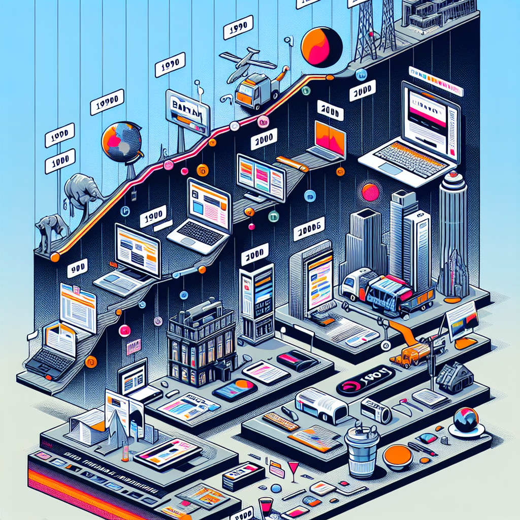
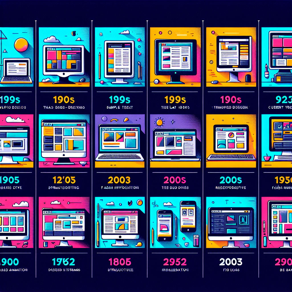
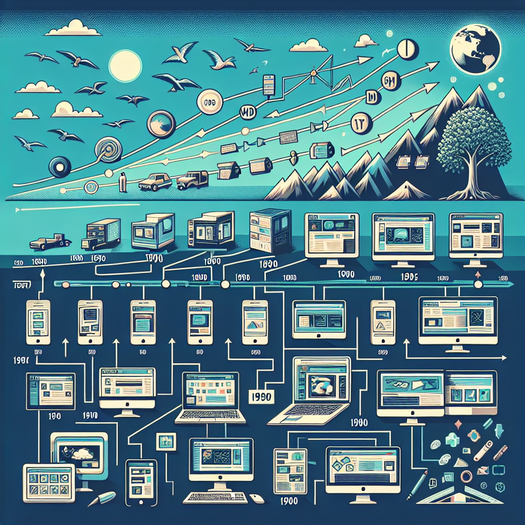
As we delve into the dynamic world of website design, it’s crucial to understand its evolution. The digital landscape has witnessed remarkable transformations since the dawn of the internet. From the static web pages of the early 2000s to today’s interactive and responsive designs, the journey of web design has been nothing short of revolutionary. In 2024, these changes are not just about aesthetics; they embody the shifting ways users interact with the web and how businesses leverage online platforms for growth.
Embracing the latest trends in website design, businesses can craft online experiences that captivate visitors, encourage engagement, and ultimately drive conversions. Whether it’s through the integration of advanced technologies or the implementation of minimalist principles, the objective remains consistent – to deliver a seamless and impactful user experience. As we explore the top trends in website design for this year, we will uncover the elements that are essential for any business looking to make a powerful statement online.
At Guru-is.com, our mission is to empower your business with innovative web solutions that stand the test of time. Since 1999, we’ve been at the forefront of website design, constantly evolving to meet the needs of our clients. If you’re ready to transform your online presence and achieve absolute web success, don’t hesitate to Get a quote from our team of experts.
The philosophy of ‘less is more’ has taken center stage in the realm of website design as we embrace minimalism. This trend prioritizes clean, uncluttered layouts, focusing on essential elements to achieve a sleek and professional look. The minimalist approach emphasizes the importance of whitespace, which is not merely emptiness, but a powerful design element that enhances readability and guides users’ attention to the most vital parts of your website.
With the adoption of minimalist design, websites become faster to load and easier to navigate, offering a user-friendly experience that is both aesthetically pleasing and functional. This trend also aligns with the mobile-first approach, as minimalism ensures that sites remain attractive and accessible on smaller screens without overwhelming users with excessive content or complex navigation.
Furthermore, a minimalist website often translates to a timeless quality, keeping your site relevant and engaging regardless of fleeting design fads. It’s about stripping down to the essentials and allowing your content to shine. By focusing on simplicity, businesses can effectively communicate their message without distraction, ensuring that the user’s journey on their site is straightforward and enjoyable.
Artificial Intelligence (AI) and Machine Learning (ML) are revolutionizing website design by enabling more personalized and dynamic user experiences. The incorporation of these advanced technologies allows websites to learn from user interactions, adapting content and functionalities to better meet individual needs. As AI and ML continue to advance, we’re witnessing the birth of websites that can predict user preferences, provide intelligent recommendations, and even automate design processes.
AI-powered chatbots have become a staple for customer service, offering instant responses and support. This technology has evolved to the point where interactions with bots are becoming increasingly human-like, improving engagement and user satisfaction. Moreover, AI is now being used in the development phase of web design, with algorithms capable of generating design elements based on user data, significantly reducing the time and effort required from designers.
Machine Learning algorithms, on the other hand, are being utilized to analyze vast amounts of data to uncover insights about user behavior. This data-driven approach helps designers create more effective user interfaces by predicting trends and user actions. As a result, websites are not only becoming more intuitive and efficient but are also offering a level of personalization that was once impossible.
In the realm of website design, the shift towards a mobile-first approach is not just a trend; it’s a fundamental change in how sites are created and structured. With the majority of internet traffic now coming from mobile devices, designers are prioritizing responsiveness and mobile usability from the outset. This ensures that websites provide an optimal experience across a range of devices, particularly on the smaller screens of smartphones and tablets.
Mobile-first design involves designing an online experience for mobile before scaling up to larger screens, which contrasts with the traditional approach that started with desktop designs. This paradigm shift is critical because it addresses the constraints and navigational considerations unique to mobile usage, such as touch interfaces and limited screen real estate. By focusing on mobile, designers can ensure that the most essential elements of a site are accessible and user-friendly, regardless of the device being used.
Implementing a mobile-first strategy also positively impacts search engine rankings. Search engines like Google have adopted mobile-first indexing, which means the mobile version of a site is considered the primary version when evaluating relevance and ranking. As such, a responsive design is not just a matter of user convenience but also a vital component of SEO strategy.
As we delve further into 2024, website design continues to evolve, and one of the most engaging trends is the use of advanced interactivity and micro-animations. These subtle yet powerful design elements capture users’ attention and enhance their experience by bringing websites to life. When applied thoughtfully, micro-animations provide visual cues that guide users through their interactions with a website, making the experience not only more intuitive but also more rewarding.
Micro-animations serve various functions; from indicating a successful form submission to drawing attention to important calls to action, they help reduce cognitive load for users. For example, a button that animates on hover can signal to users that it is clickable, improving usability. Advanced interactivity, on the other hand, can include scroll-triggered animations or dynamic content loading, which adds a layer of depth and engagement to the browsing experience.
However, it’s crucial that these animations and interactive elements are used sparingly and strategically. Overuse can lead to distraction and even frustration, especially if it affects the website’s loading time or overall performance. The key is to strike a balance, ensuring that the animations serve a purpose and enhance the user’s journey, rather than merely serving as decoration. When done correctly, they can be a powerful tool for storytelling and branding, making a website not just a platform, but an experience to remember.
Embracing sustainability in website design has become more than just a trend; it’s an essential practice for businesses looking to demonstrate their commitment to eco-friendly initiatives. As we navigate 2024, sustainable web design practices are gaining traction, recognizing the impact of digital products on the environment. Websites optimized for energy efficiency not only load faster and provide a better user experience but also reduce carbon footprints by using less energy.
Key practices in sustainable web design include optimizing images and videos for faster loading times, utilizing green hosting providers that run on renewable energy, and implementing coding best practices that minimize server requests. Additionally, the use of dark mode options not only reduces screen glare and saves battery life but also consumes less energy. By prioritizing accessibility and usability, designers can ensure that their websites are not only environmentally conscious but also inclusive.
Including sustainability as a core aspect of your brand’s online presence can resonate with environmentally conscious consumers, reflecting a responsible and forward-thinking business approach. If you’re inspired to make your website part of this positive change, get a quote at Guru-is.com. Our team is dedicated to crafting websites that are not only visually stunning and user-friendly but also aligned with the best practices for eco-friendly web design. Join us in leading the way towards a more sustainable digital future.
